5 Logos with Hidden Messages That Will Blow Your Mind
Logos are more than just symbols; they are the face of a brand, telling a story and communicating its essence in a single visual. But some brands take their logos a step further by embedding hidden messages, creating a layer of intrigue and brilliance that often goes unnoticed.
Whether you're a design enthusiast, marketing professional, or logo designer, exploring these hidden details can inspire creativity and deepen your appreciation for the art of logo design. Here are five logos with surprising hidden messages and why they’re design masterpieces.
1. FedEx – A Subtle Arrow of Precision
At first glance, the FedEx logo might seem like simple text using a sleek, modern font. But look closer between the “E” and the “x,” and you’ll discover a cleverly embedded arrow.
This arrow is no accident—it symbolizes speed, precision, and reliability, values at the core of FedEx's global delivery service. What makes it even more brilliant is the subtlety; the arrow doesn't scream for attention but rewards those who take a closer look. It's a shining example of how minimalism can still convey a powerful message.
Design Tip
When designing a logo, think about how hidden shapes and negative space (like the arrow in FedEx) can subtly communicate your brand's message. A thoughtful use of these elements not only creates a memorable design but also aligns with your overall branding strategy, reinforcing the values and story your brand represents.
2. Baskin Robbins – The Sweet Spot
Baskin Robbins, the beloved ice cream brand, doesn’t just tell you it’s about indulgence—it sneaks a number into its logo to highlight its heritage. Take a look at the pink elements of the letters "B" and "R" within the logo, and you’ll notice the number "31."
Why "31"? Baskin Robbins is famous for offering a different flavor of ice cream for each day of the month. This clever nod to their variety gives their logo an extra scoop of meaning every time you see it.
Design Tip
Play with typography and colors to give your audience a memorable final touch. Sometimes, integrating a numerical or visual element that reflects your brand's core offering can leave a lasting impression.
3. Amazon – Smiles All Around
Amazon might be the largest e-commerce brand in the world, but its approach to logo design is refreshingly human. The logo’s famed orange arrow beneath the text isn’t just a playful flourish. It serves a dual purpose—it represents a smile, symbolizing customer satisfaction, while connecting "A" to "Z," subtly communicating that Amazon sells everything from A to Z.
This dual-layered design perfectly encapsulates Amazon’s promise of vast selection and happy customers. It’s simple, recognizable, and endlessly smart.
Design Tip
Dual-purpose design elements, like Amazon’s arrow, can create a connection with viewers and communicate multiple ideas simultaneously. Think about how you can combine functions in your logo's features.
4. Toyota – Beyond the Wheel
Toyota’s logo is one of the most iconic in the auto industry, but did you know there's more to it than just the overlapping ovals? The entire logo is constructed so that all the letters of the word "Toyota" are contained within the ovals.
This intricate detail highlights Toyota’s engineering precision and the thoughtful craftsmanship behind its vehicles. The overlapping ovals also suggest unity and a global reach, reinforcing its brand identity as a leader in the automotive world.
Design Tip
Instead of relying only on abstract visuals, think about blending symbolism and representation. Toyota takes an abstract shape and connects it back to its identity, making the logo deeply personal for the brand.
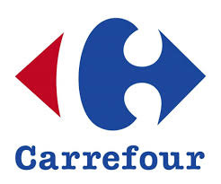
5. Carrefour – Hidden in Plain Sight
Carrefour, the famous French supermarket chain, has a logo that’s a masterclass in using negative space. The two arrows, red and blue, cleverly form the outline of a "C" in the center when you focus on the white negative space.
This small detail is more than just aesthetic—it represents Carrefour's name, which translates to “crossroads” in French, and reflects the idea of connection and direction. It’s a prime example of how simplicity can carry deep meaning.
Design Tip
Negative space is a powerful tool that lets you infuse creativity and subtlety into your design. It keeps the logo clean yet intriguing for those who take the time to notice.
Final Thoughts
Logos like these are more than static visuals—they’re stories, ideas, and messages wrapped in design. By embedding meaning into the shapes, colors, and negative spaces, brands create logos that are not only visually striking but also intellectually rewarding.
If you're a designer, marketer, or business owner, take a cue from these examples. Think about how you can fuse creativity and strategy into your own visual identity. Want to level up your logo design or need feedback on your ideas? Contact our design team today to craft something memorable!


